Glazing and Comfort Tool
An aid for designing glazed facades with the desired levels of transparency, comfort and energy performance
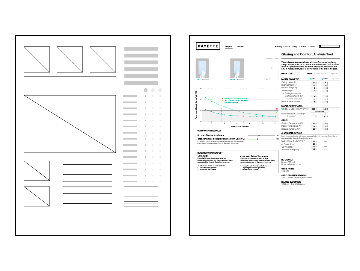
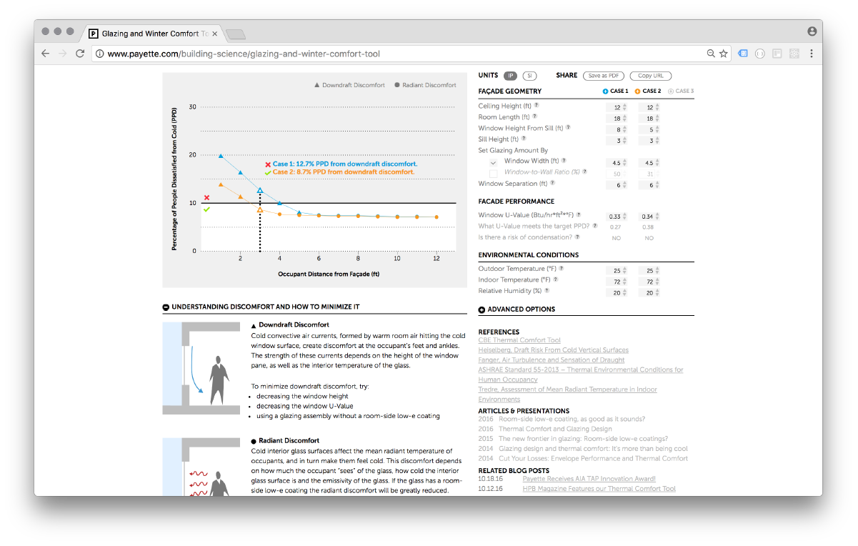
Through a set of inputs, designers can adjust and compare glazing geometries and thermal properties to understand occupant comfort within the space. A visual representation of the proposed facade allows users to compare aesthetic choices with building performance results. The tool quantifies overall radiant heat loss through the glass as well as the downdraft along the glass, both of which lead to occupant discomfort.
Role: design, front-end development, user testing and interveiws, interface mockups and wireframes
Tools: d3.js, Sketch, Python
Designer at Payette, 2016

Understanding Needs
Throughout the project, I conducted user research and testing with colleagues to identify what information was pertinent to selecting glazing systems. Through this process of iterative design and testing, a visual hierarchy of information and user-feedback was established to provide clear information.

Offering Solutions
Beyond quantifying thermal comfort, the tool also offers explanation of the conditions and how to improve discomfort. While valuable information, the tool prioritizes the visual facade representation and resulting graph as they dynamically show changes.

Sharing Findings
As the design of a building involves many stakeholders, from the architects and engineers to clients and end-users, the ability to share the user's findings through both print (PDF) and live (URL) formats was key.